Bringing the European Public Health Alliance into the 21st Century
The European Public Health Alliance, commonly known as EPHA, is an not-for-profit, member-led organisation made up of public health NGOs, patient groups, health professionals and disease groups, working to improve health and strengthen the voice of public health in Europe.
With a branding dating back to the early days of the organisation, and a website that was work-intensive and dated, EPHA was looking for a fresh look to strengthen their position as a leading organisation in the Health sector. Therefore, a complete rebrand as well as a completely new website and collaterals was put together.
Logo
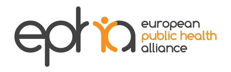
The organisation’s original logo featured a little character, a representation of Mankind, that was very central to their message. Therefore, it was important for them to keep this line of thought in the new logo. Another trait was the orange by which they were recognised – it was also necessary to keep a palette the featured a bright orange as the key element.
Colours & Fonts
Although the orange was central to the organisation, the scope highlighted the need for their different campaigns to have their own identity. It was therefore decided to create a specific palette for each section.
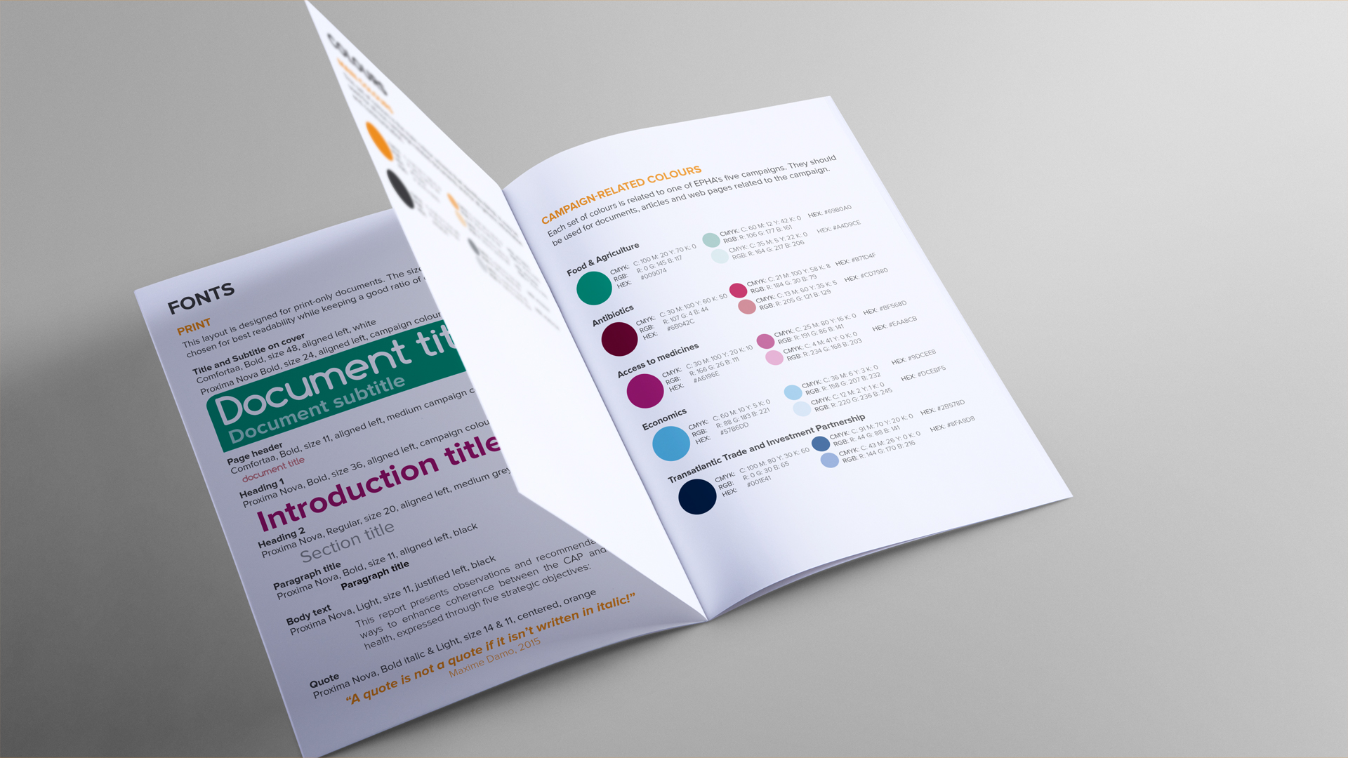
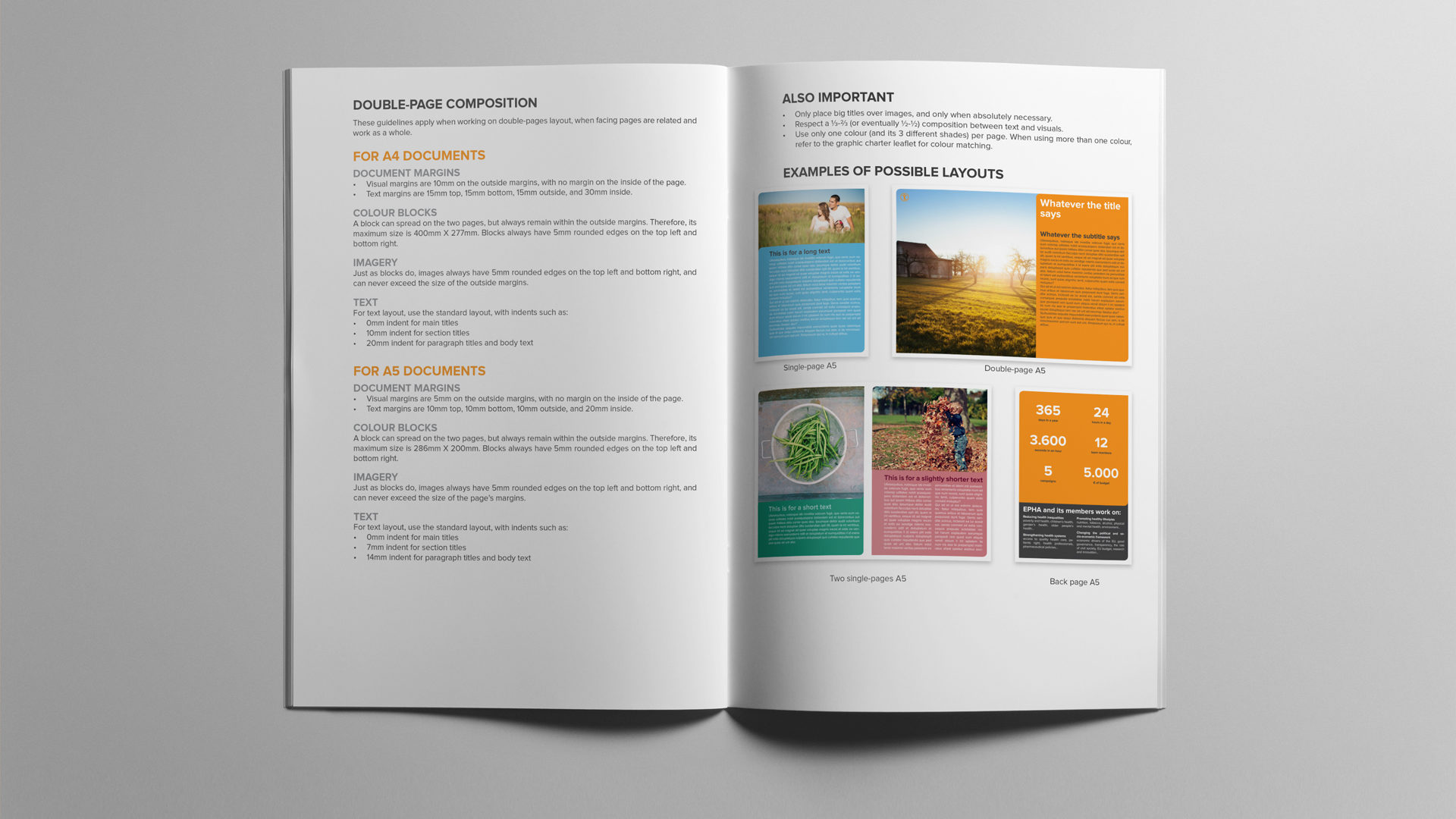
Once the scope was completed, a brand guide was handed to every employee, so as to help with the transition. The documents explained the formatting of new documents and offered some examples and advice.
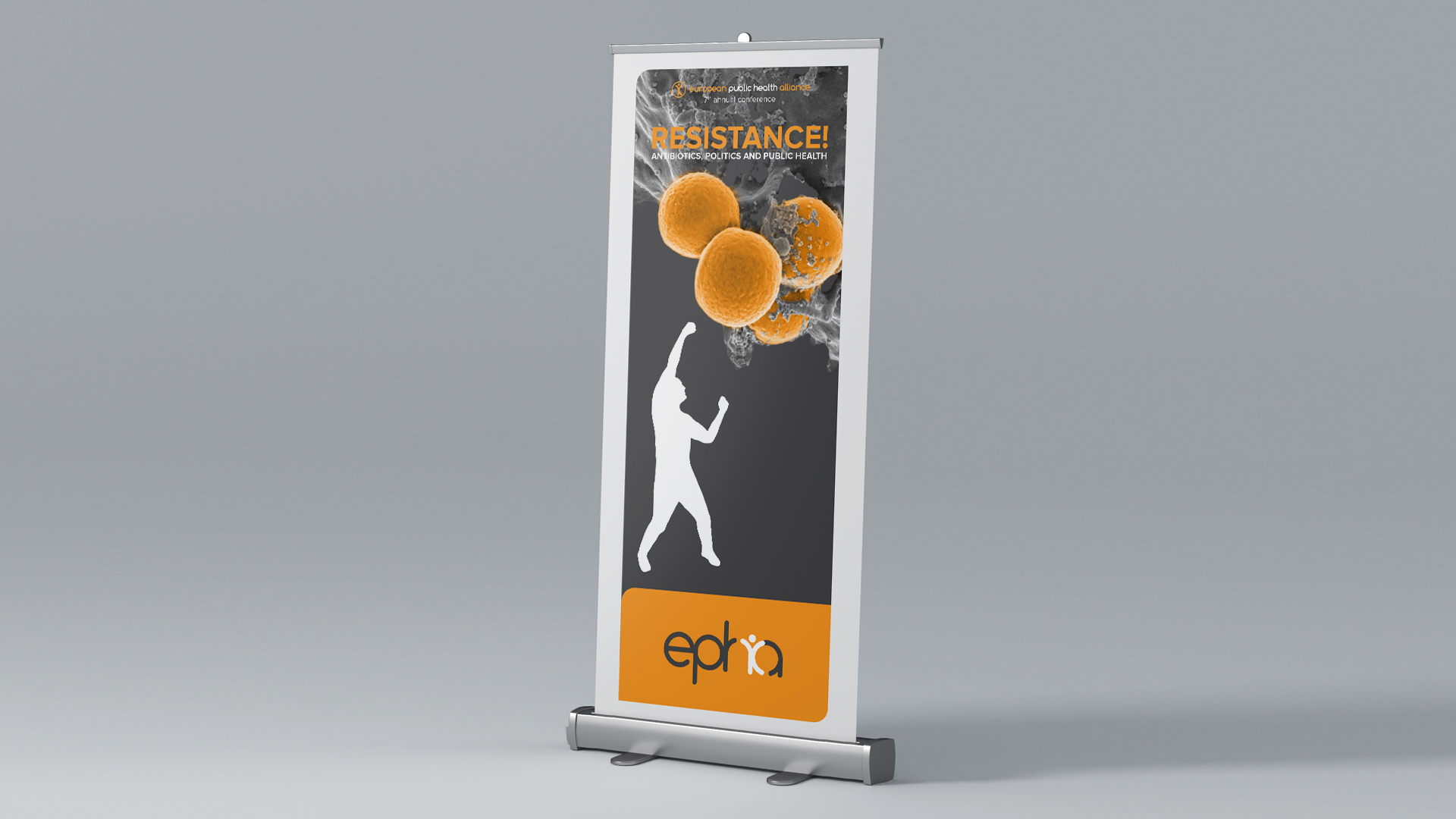
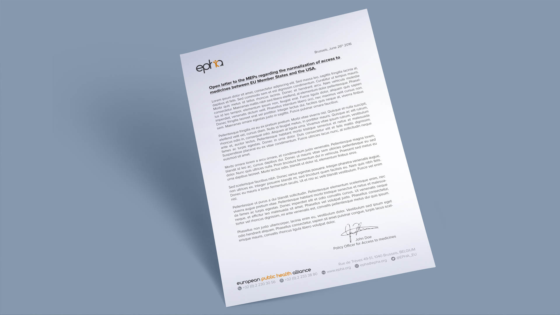
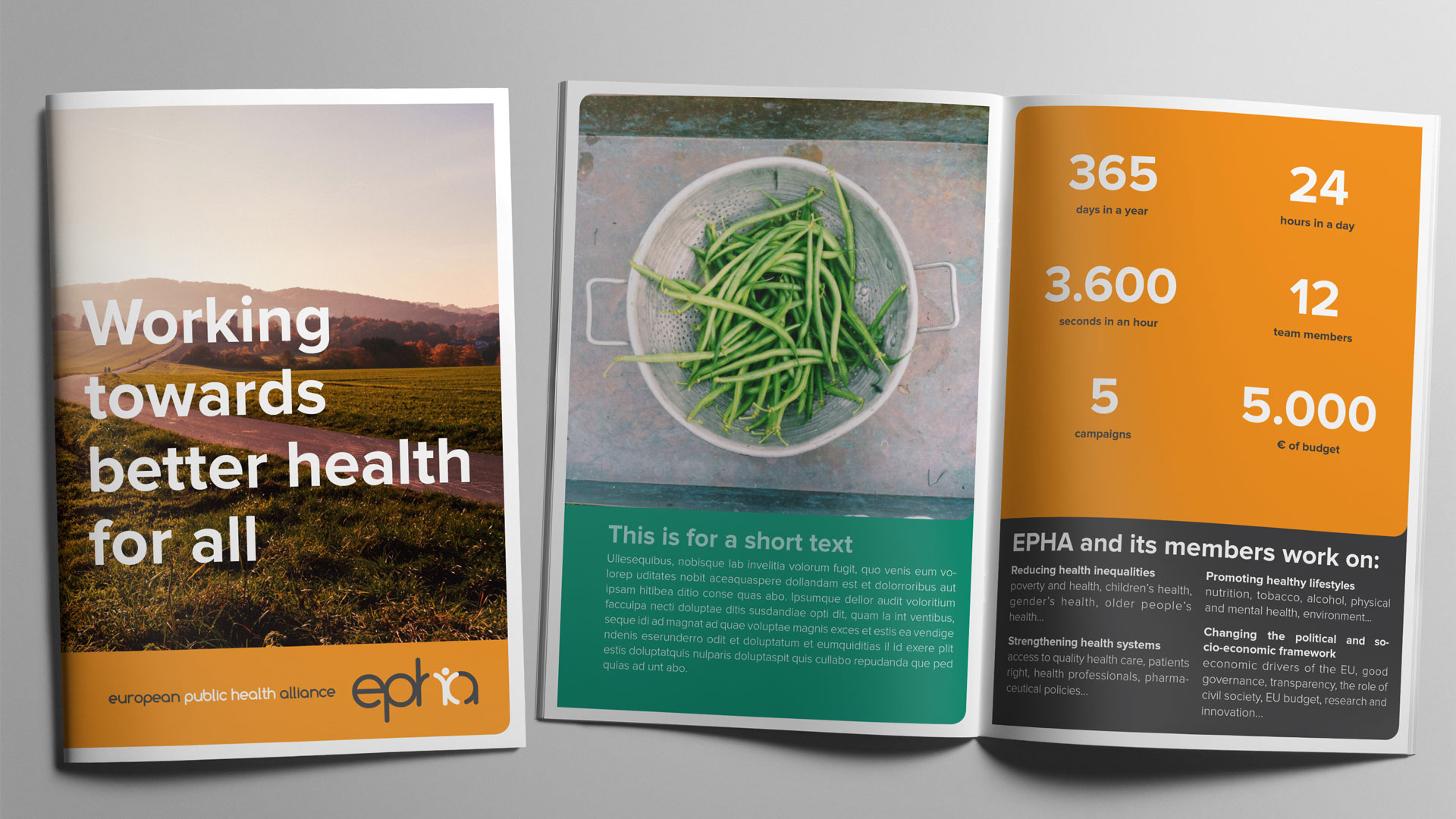
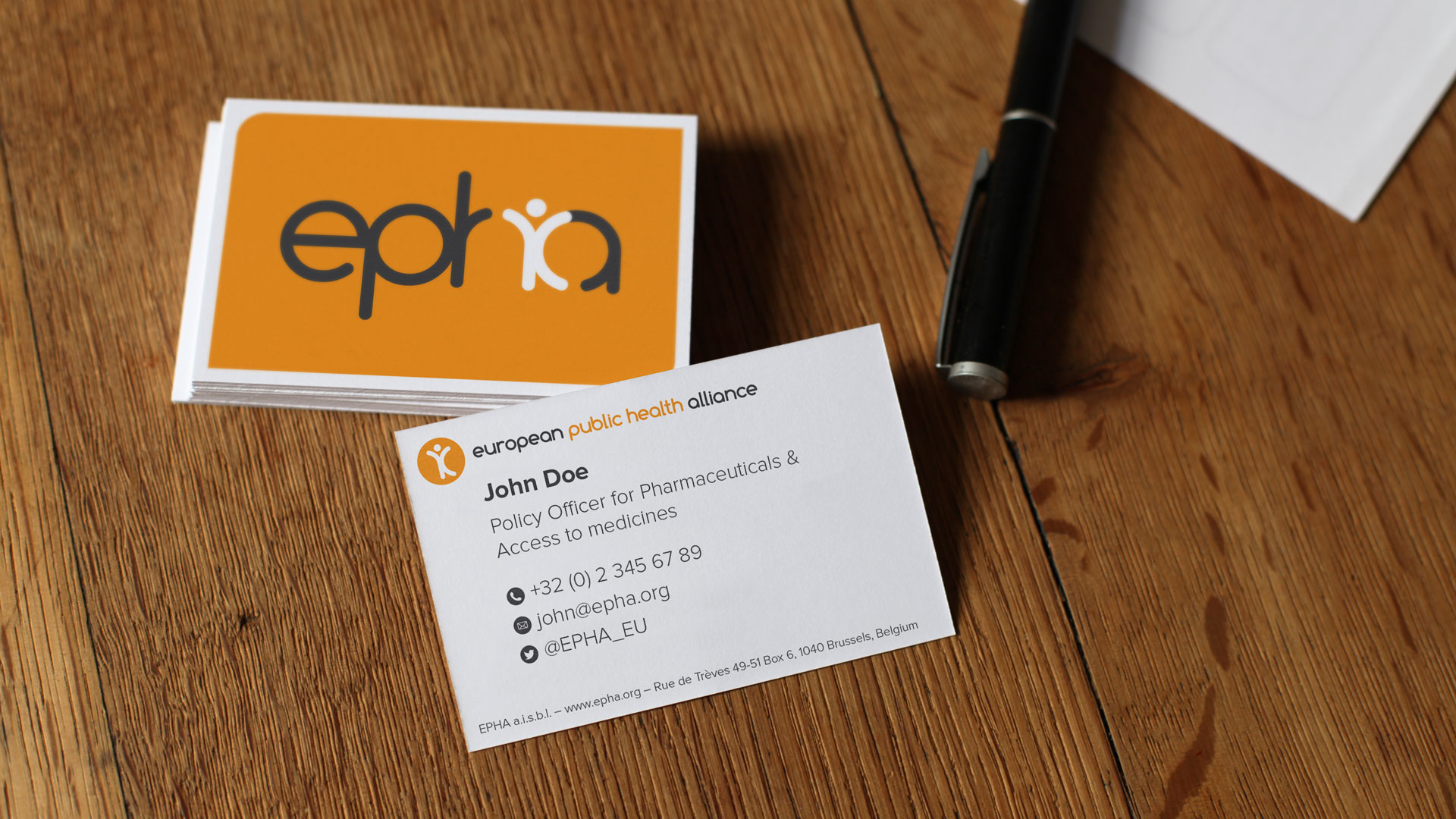
Stationary & Marketing Material