
Helping Connected Places Catapult Secure a Tender Bid
PLEASE NOTE: Due to the confidential nature of the content of this project, only a portion of the assets is displayed and some parts had to be redacted.
As an answer to a Tender opened by an East London borough for the development of a system to improve urban planning at their level, Connected Places Catapult had a well-established platform that had been developed for several years and was the perfect candidate to push the borough into the 21st century. However, the platform being such an innovative product needed a brand that would make it stand out from its competition, and therefore hope to win the bid.
I created a whole new identity that included a set of name proposals, logos, colour palette and fonts. The name that was retained was BuildUp, as it referenced the construction sector as well as the digital development, and adds a dynamic dimension.
Logo

The logo features strong, bold, simple characters, with subtle elements of the digital world through the faceted edges added to the last two characters, representing pixels.


Multiple versions of the logo allowed for a variety of use over coloured backgrounds and imagery.
Colour palette & fonts
Two colour palettes were developed: an RGB palette for online publications, with very bright colours, and a toned-down CMYK version for print documents.


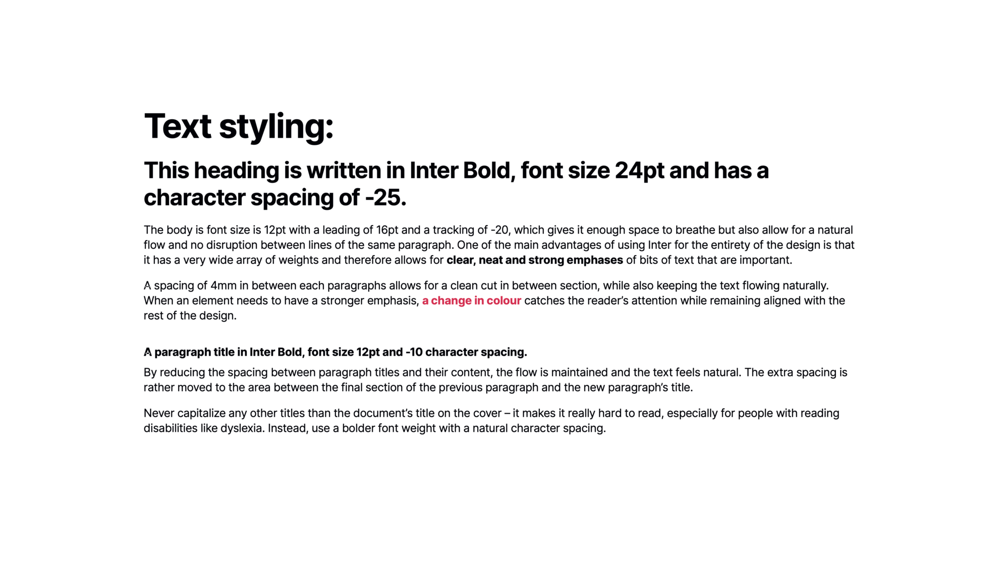
A single font family was deemed the best option, as it strong look and diversity of weights meant it could convey any message in a clear, easily readable and attractive way.
Illustrations & graphs
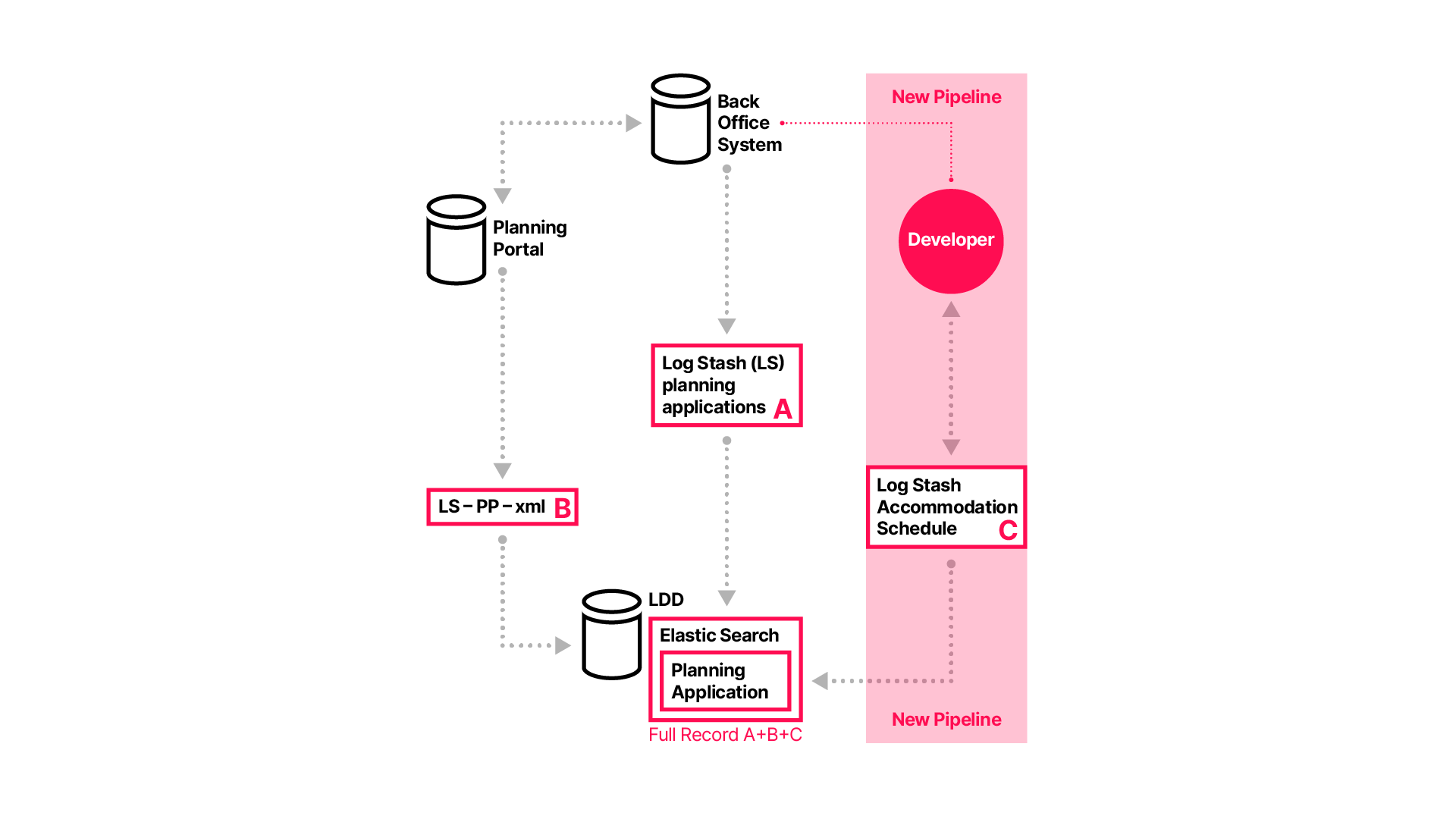
To align the visuals with the brand, a series of illustrations and graphs used in the presentation were created in Adobe Illustrator and inserted in the final presentation in SVG form, to keep their crispness and readability at any size.



Tender presentation
The final presentation was put together by the team using all the assets previously created and glossed up by myself.
(Please note this is only a sample of the final output, including some redacted text for confidentiality.)


